Scientific American, Sexism, and a Quick Update

scientific-american-logo

Okay, so I know the blog has been quiet for a week, but I wanted you all to know why. (Breaking the 4th wall – I’ll try to make up for the shortcomings with a few extra posts over the coming week.)

So over the summer I was an intern at Scientific American magazine, and if you follow any science journalism, you’ve heard about the controversy surrounding their temporary removal of a blog post and the somewhat unrelated resignation of their legendary Blogs Editor Bora Zivkovic. Two pretty bad events that were handled very appropriately by the Scientific American staff.

On the other hand, I’m pretty upset about how the internet is handling it. There’s a lot of rhetoric, insults and general misunderstanding about the whole thing, so I blogged super hard about it for my Health and Science Reporting class. Please give this piece a read and share it. I highlight and address the parties responsible for spreading some damaging (and illogical) perspectives.

I know the work is only a logical drop in a rhetoric ocean, but it needed to be said. Here’s to hoping our nation’s most esteemed science magazine earns back some of it’s much-deserved respect.

On another note, this Wednesday at 7 p.m. in Martin Hall I’ll be speaking on a panel about finding, nailing and succeeding at high-level media internships. You should come and hang out, it’s gonna be a great time.

Also this Saturday I’ll be speaking at the School of Journalism’s Open House from 1 to 3 p.m. You should also come to that and learn more about the School of Journalism, especially if you’re a prospective student.

Other than that, look forward to posts this week about magazine branding and the New Vocabulary of Magazines. Next week I’m trying to get the coolest Q&A ever with a high-level magazine design director – it’s a secret who it is!


New York Magazine Web Redesign: The Elephant in the Room

new-york-magazine-logo
So New York Magazine debuted their new homepage yesterday, and from what I can tell, the internet is underwhelmed by the change.  Even the magazine itself is asking us to be patient, and I’m not sure why. Below is the before and after of the homepage.

Before:

a-Screen Shot 2013-05-31 at 1.32.58 PM

After:

NYMAG

It’s true there isn’t much of a shift, but there’s a huge aspect of this website nobody else is talking about: the mobile version.

I don’t know why people aren’t reviewing the mobile version of the site. In fact, it’s kind of shocking – mobile news consumption is spiking to legendary levels, and everyone is ranting about mobile journalism being “the future.” If you are starting a news platform, you need to make it for mobile. Doing otherwise would be shortsighted, considering usage trends.

So why the hell is nobody talking about the New York mobile site?

Screw it. I’ll do it. This website is killer and obviously took a lot of work. If you ask me, the website looks and operates better on a mobile device, making New York a powerful presence in the world of digital magazines.

Let’s explore.

New York’s website has adopted a smooth, intuitive responsive design. The spans and divs flow together smoothly, and there are three “snaps” when re-sizing. It’s no secret New York is dedicated to this design – last year they tried to pretend they weren’t totally committed to it, but I’m not fooled. Responsive is awesome: it’s easier to code (than say, 3 different apps for mobile software), it creates continuity between platforms and it looks damn cool.

And that intuitive thing: there’s a running argument about the effectiveness of mobile UX, and this is nothing new. Hell, there’s an entire acronym dedicated to the interactions between human beings and technology: HF&E, or Human Factors and Ergonomics. (Spoiler alert – I’ll have a blog about this next week.)
My argument is that New York’s website is positively ergonomic. There’s only 4 swipe directions on the x and y axes, and the website is designed to promote that swipe. Look at this screencap from my phone.

Screenshot_2013-10-08-14-55-46

See how the second story is cut off from the right? The second I saw it I knew I had to swipe right, which led me to a revolving queue of top stories. Also see the same cutting effect at the bottom of the frame.

Also easy to comprehend is the tabs at the bottom of the frame. I don’t know what they mean (I’m not a regular reader) but made sense to snap through them. See how they’re framed? They look just like tabs in a web browser. There’s that UI/UX culture I was telling you about. If it ain’t broken, don’t fix it.

Is that intuitive enough for you, ladies? Needless to say, I’m endlessly excited for New York Magazine – they keep moving up. They just won the Cover of the Year Award from ASME over the summer, and I don’t think they’ll be stopping this excellence anytime soon. I can’t believe I worked in the same office building as them.

iwan_baans_post-sandy_manhattan_shot_makes_asme_cover_of_the_year

A Map of the Magazine Industry: A Work in Perpetual Motion

Like toys, cars or clothes, magazines are a consumer product. Anyone looking to publish a magazine must be able to identify and appeal to their target consumers. For many magazines, location is key – it’s hard to cover a specific community if you aren’t a part of it.

Below is a constantly-growing-ever-changing Google map of magazine headquarters around the world. One can observe trends in these locations, from the fashion magazines in New York, the political magazines in D.C., and the home & garden magazines in the Midwest.

These trends prove that magazines are an effective litmus test of culture. By looking at where these magazines are located, who they’re covering and who is subscribing, we can track the evolution of people’s cultural interests. For example, the success of the legendary “Seven Sisters” magazines is representative of a once-dominant subculture in the American Midwest: stay-at-home mothers with children and working husbands, all of whom are decidedly Caucasian. Now a few of the Seven Sisters are evolving to fit modern tastes, an act also representative of cultural shifts.

Hell, when I was adding magazines to the map off the top of my head, a large handful were New York-based and published by Condé Nast. Apparently this shows I’m interested in “provocative, influential, award-winning content.”

Like our society, magazines are constantly changing and moving. Stay on top of how they’re changing – both the content and how they’re delivering it – and you’ll know a lot about humanity.


National Geographic’s 125th Birthday Party is on Tumblr (and it’s wild)

tumblr_mtsz09gScI1s7f3fyo1_1280

One of the oldest legacies in magazine journalism, National Geographic Magazine, is having it’s 125th anniversary this year. To celebrate, they’re highlighting the driving force behind the magazine: photography. They’re hosting a huge crunchy speaker series in Arizona, their October issue is full of their best photography, and they’re highlighting some of the best work on their website.

And oh yeah – like every 13-year-old girl, they made a Tumblr. And I think it’s one of the smartest things they’ve ever done.

what-you-talkin-bout-willis-o

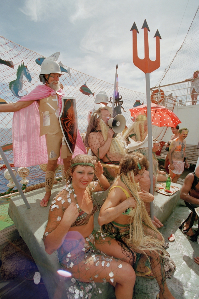
I know what you’re all thinking about Tumblr, and I want you to throw it out the window. If you’re an adult like me, NatGeoFound is probably the coolest Tumblr feed you’ve ever seen. It’s a daily helping of photography from throughout NatGeo’s history, with every picture dated and captioned. Scrolling down the feed is nothing short of an intense experience.

And as I’ll argue after the photography break, getting on Tumblr fits National Geographic’s strategic plans in a number of beautiful ways. The photos in this post (barring the GIF of Gary Coleman) came from NatGeoFound.  Check out the feed. I know it will be hard, but please come back.

tumblr_mtbtcr5X9R1s7f3fyo1_1280

tumblr_mtm2ksQ94g1s7f3fyo1_1280

tumblr_mtcd75zgJk1s7f3fyo1_1280

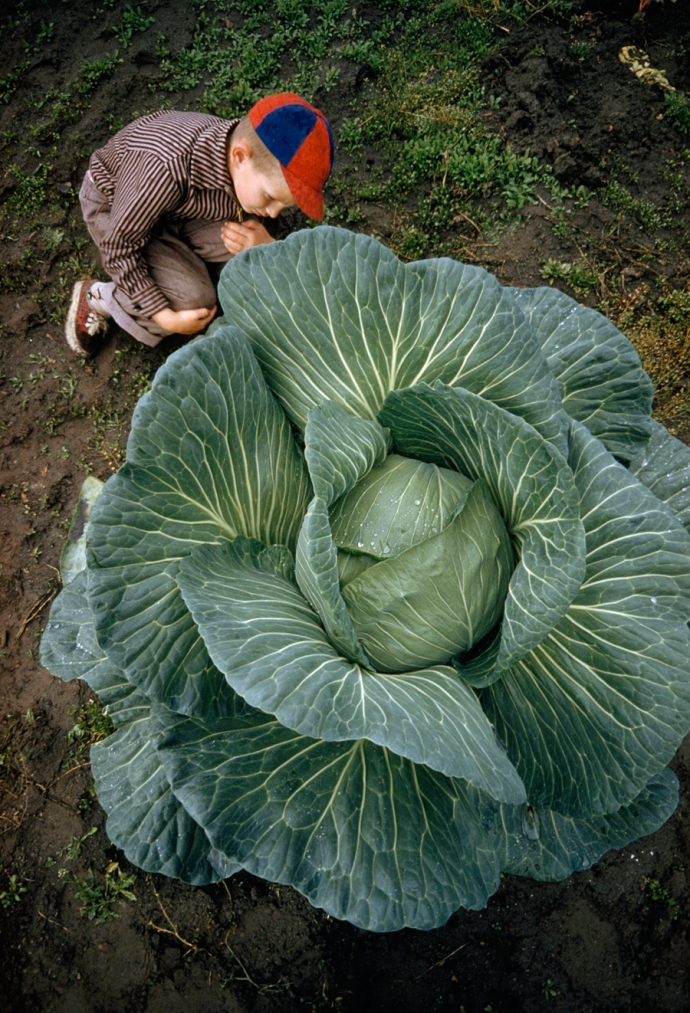
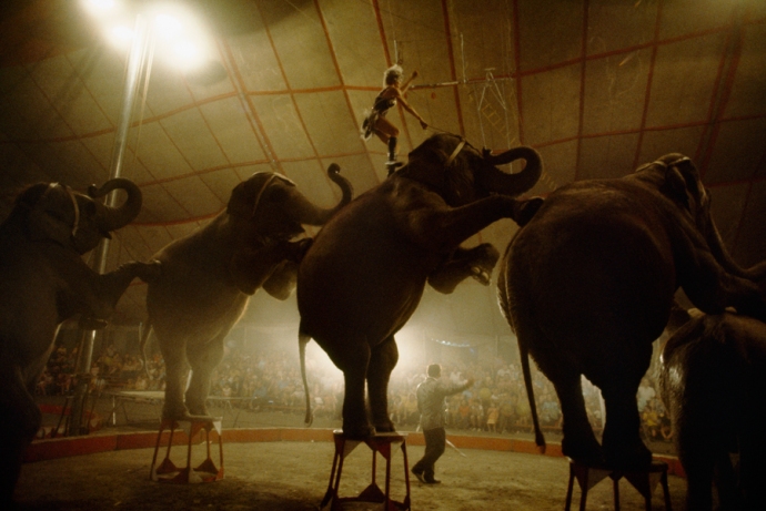
Photography has long been the cornerstone of National Geographic. They’ve successfully positioned themselves as the leading force in photojournalism, and many a user has been enthralled by their work. The Tumblr feed is mesmerizing.

Another interesting aspect of National Geographic Magazine is their forward-thinking bent. I guess you don’t last 125 years without learning something. Making this Tumblr signals NatGeo’s focus on adapting to the digital future of journalism, something hinted at in this interview with NatGeo Editor-in-Chief Chris Johns. He really showed NatGeo’s digital aspirations in this quote:

“We aim to be the leader in visual factual entertainment. The blurring of the lines between photography and video and between print and digital platforms has created a rich environment for us to experiment with immersive storytelling that amplifies voice and helps people connect more deeply with our coverage across editorial and social platforms.”

So why is this Tumblr a good idea? Let’s explore with a list.

If they want to stay relevant, they need to engage a younger audience. Flip through a NatGeo and you’ll notice almost all the magazines are geared towards an older demographic. The median subscriber age is around 45, according to their own measurements. And I hate to be morbid, but let’s be realistic: these folks are gonna die eventually. Nat Geo Kids is cool and all, but most of those subscriptions are coming from parents who already have their kid hooked on the actual magazine.

Having a Tumblr is a fantastic way to engage an audience that is probably heavily invested in the internet already. Get them hooked on Nat Geo photography now and they’ll be readers for life. Speaking of photography…

Tumblr is a visual platform. It’s driven by images, even if most of these images are sepia-tone shots of vintage crap overlaid with words.

tumblr_mfwwsknE6X1rg09p7o1_500

Case in point. Decidedly not NatGeo.

Still, Tumblr users have an appreciation for photography, and while they may end up slapping some pithy quotes on these photos, Nat Geo has an untapped audience here. Hell, they have an untapped audience all over the internet, because…

Everyone is visually oriented. Videos, GIFs, photos, tweets – the internet is shifting towards a culture of easily digested visual content. And that’s no surprise, considering human beings are visually-oriented creatures. Maybe that’s one factor in National Geographic’s massive success so far.

The best part about this Tumblr is the symbolism. Nat Geo is really following through with their plan to establish a powerful internet presence, which is refreshing. A year ago then-CEO John Fahey hinted at the potential end of a print product, and I couldn’t believe it. Even making this Tumblr is a good step forward for the magazine, and it represents a level of quality and forethought missing from other major publishers. Lets hope the new CEO, former NPR man Gary Knell, is just as innovative.

Take a hint, magazine world. Nat Geo is old as dirt and is still whipping all your butts.